
Is this the perfect match? The relatively new concept of Perfect Pairings, whereby consumers are given access to professionally compiled mood boards for surface finishes and fittings, has hit the sweet spot!
Such has been the response from colour-challenged consumers, confused by the huge array of paint colour and surfaces available, that the Caesarstone and Wattyl brands have released a second collaboration.
Perfect Pairings II, much like its predecessor, delivers a range of sublime pairings of colours and materials in surface finishes and fittings for kitchens, bathrooms and open plan living areas.
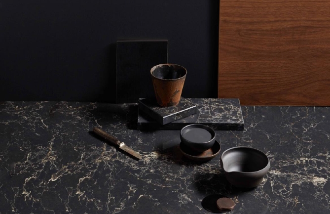
This latest offering highlights one of the fastest growing trends in kitchens and bathrooms – the deep, dark colour palette that instantly injects a sense of richness and drama. The pairing of Caesarstone Vanilla Noir with Wattyl Grey Ember is typical of the look – the polished ebony base of Vanilla Noir, with its bold beige and vanilla veining, is enhanced by the intensity of the deep charcoal hue of Wattyl Grey Ember. A choice of black or walnut timber cabinetry, along with brushed gunmetal or rustic iron tapware, are inspired additions to the colour palette.
In complete contrast is the ultimate white palette, where Caesarstone Empira White – the purest of white bases overlaid with a combination of fine black veins and shadowy alluvial layers – is paired with the pristine white of Wattyl’s Calcium, alongside cabinetry and tapware options in a matching white or rich black. It’s a clean, crisp look that provides the perfect backdrop to textured decorative elements.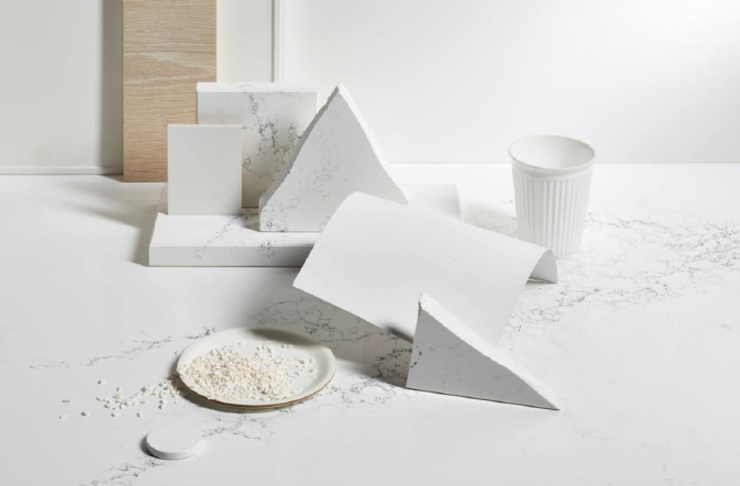
There are also some rich earth colours in this latest offering of Perfect Pairings – such as Wattyl’s Red Ochre (from its current 2020 colour palette), a rich terracotta that adds an earthy warmth to any space. This colour is teamed with Caesarstone Cloudburst Concrete, a more delicate take on industrial texture featuring a subtle cloudburst pattern in soft greys and pearl. Copper tapware and oak cabinetry completes the look.
Another saturated hue is Wattyl Secret Shine, a high chroma yellow that is both upbeat and exciting, especially when teamed with Caesarstone Empira White. The deep grey and charcoal veins of the quartz surface contribute to this luxe look that can be accented with metallics and mirror.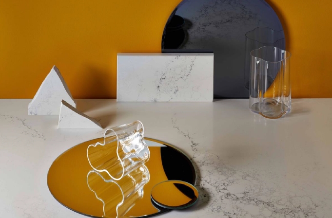
No colour pairings would be complete without a foolproof take on greys – a winning combination where the mix is not too cool, not too bland but an intriguing mix of warm colour and muted texture.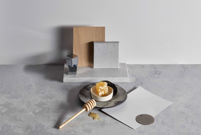
Caesarstone’s Airy Concrete, a superb organic mix of dark grey and white tones that, along with its authentic rough concrete feel, is a distinctive surface texture whose versatility is one of its many strengths. Here it is perfectly partnered with Wattyl Sirens Call, a light, smoky grey with a serene sense of warmth. Finishing decorative elements include the balanced hues of beautiful Beech cabinetry and brushed nickel tapware and hardware.
Best of all, the Wattyl/Caesarstone collaboration successfully walks the fine line between personalised colour choices and timeless style. It caters for a wide selection of architectural themes and consumer demographics – from those who want to learn how to create a customised, on-trend statement kitchen or bathroom to those wanting to nail the effortless style and elegance of a colour palette that is perennially fresh.
The Caesarstone/Wattyl collaboration can be viewed at www.caesarstone.com.au/perfect-pairings and www.wattyl.com.au/Caesarstone