
‘Design meets emotion’ is the overarching sentiment in a far-reaching piece of Australian research, conducted by Wattyl, and designed to examine virtually every aspect of our lifestyles.
The research forms the basis for Wattyl’s annual colour forecast and points to a widespread desire for calm and simplicity in a world where most consumers feel overwhelmed with fast-paced living, fake news and concerns regarding the environment, employment and politics.
We are embracing craft and wellness, honesty and authenticity as an antidote and buffer. We are creating interiors that are domestic cocoons exuding sensory tactility, where minimalism continues to flourish through the use of colour and considered aesthetics – and design instills emotion.
Wattyl has produced four distinct colour palettes that provide consumers with a canvas with which to create a personal interpretation of a look where design meets emotion and craft, technology and wellness intersect.
The four palettes in the Wattyl 2109 colour trend forecast are Well Rounded, Green Scene, Sensory Darks and High Expectations.
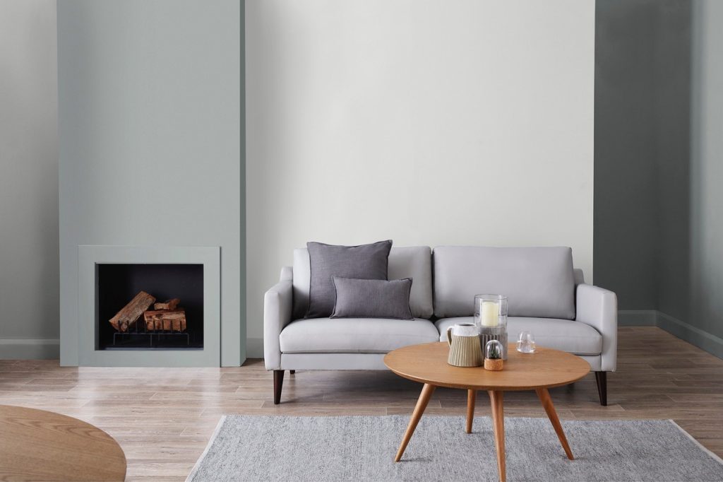
WELL ROUNDED
Blurring the lines of downtime, dreamtime and worktime, this palette reflects the melding of conventionally separate spaces such as work and home to create a more harmonious life balance and increased flexibility in our working/leisure ratio. Simple plains of balanced colour ensure calming, open, androgynous spaces that perform as places for rest, recreation and productivity.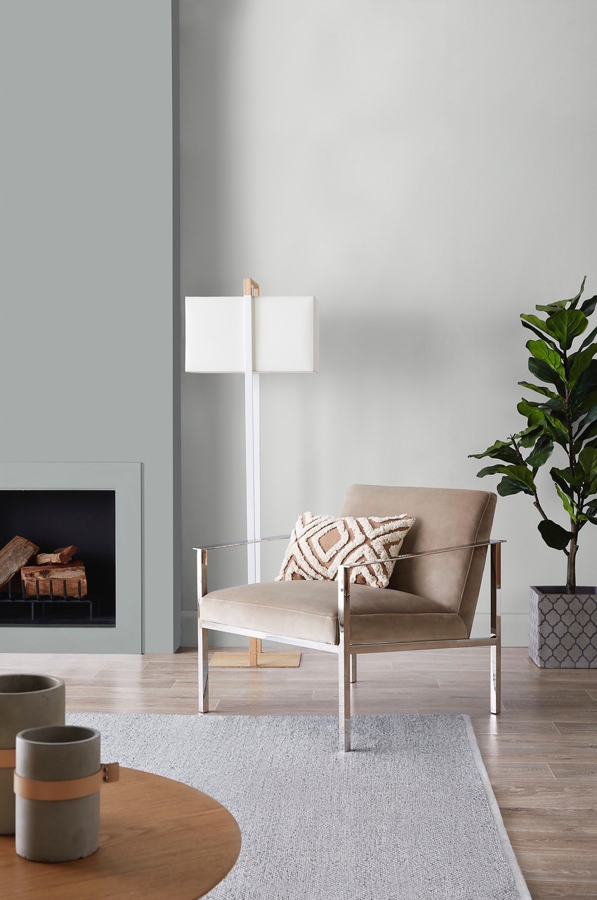 GREEN SCENE
The integration of wellness, nature and conscious design is fundamental, across homes and lifestyle products, to surrounding ourselves with the natural, the organic and low impact design. The use of plants in interiors, to both clean the air we breathe and satisfy our cravings for nature and the outdoors, is now widespread. The Green Scene palette of nature-inspired hues, dominated by soft greens, is restful, natural, muted and fresh.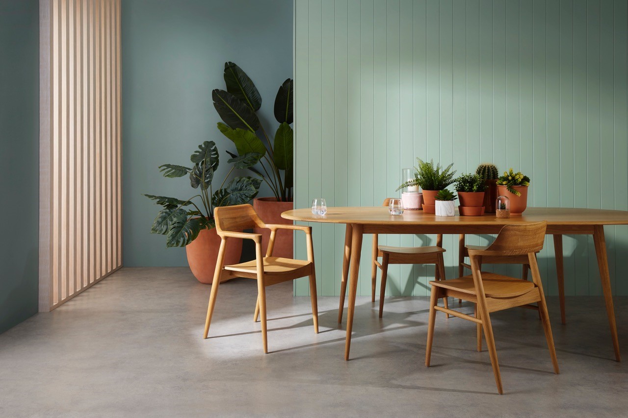 SENSORY DARKS
Rich, dark hues have the ability to cocoon us, allowing us to disconnect and concentrate only on the timelessness of our surroundings. Deep, rich tones of blue and green, touched by glimmers of metallics and mustard, are essential to complement tactile surfaces and luxurious textures.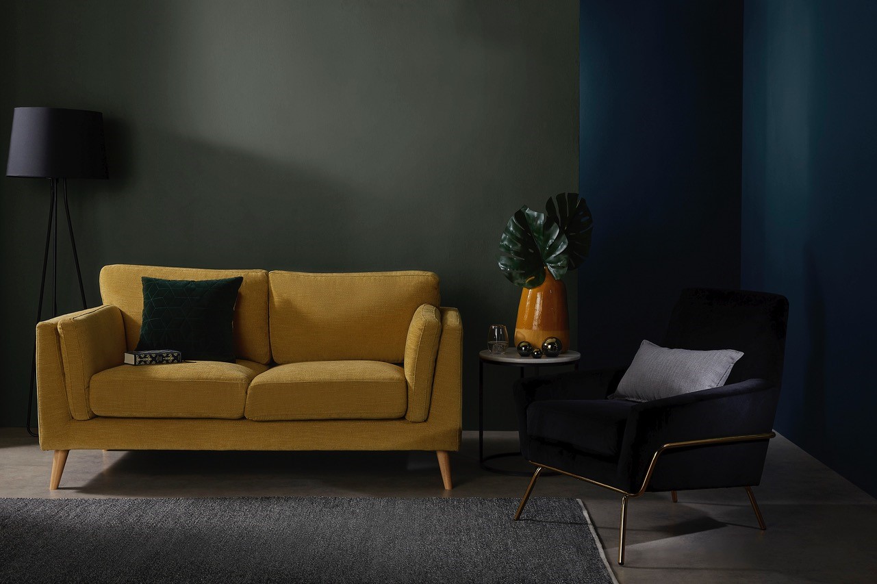 HIGH EXPECTATIONS
Many of us crave the highly considered aesthetic, with fresh gourmet colours, that graces many an insta post – colours such as an evolved millennial pink matched with ink blue and raspberry accents. The look is luxe and tailored, exuding quality and tactile beauty.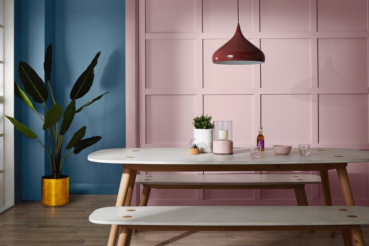 The 2019 Colour Palettes are available in Wattyl’s ultra premium id Interior low VOC paints – Contemporary Matt, Luxury Low Sheen, Silky Satin and Advanced Low Sheen.
Available nationally from Mitre 10, Home Timber Hardware, Paint Place, Solver Paint Centres and other paint specialists.
For more information visit colourtrends.wattyl.com.au