
Wattyl has released its colour trends forecast for 2018. In a fast-paced world of hi-tech; fake news; and increasing pollution, Wattyl sees our homes as sanctuaries, personal havens where we can refocus and re-balance. The brand’s four colour palettes for next year capture our collective mood for living spaces that feel both safe and nurturing.
Unlike many colour trend forecasts, Wattyl’s predictions are based on extensive global research into our lifestyles and the multiple factors affecting our sense of place and wellbeing. Findings point to an increased focus on the home being considered a refuge, a place to retreat from the fast pace of everyday life and recharge. FOMO (fear of missing out) has been replaced by JOMO (joy of missing out)!
And while each of us is increasingly dependent on technology, the research suggests we have a growing sense of nostalgia; a yearning for simpler times as a counterbalance to the clamour and pace of the outside world.
Wattyl has monitored and analysed the global trends, looked at living behaviour and design styles and translated them into four colour palettes that enable us to create homes that reflect our collective mood for spaces that feel both safe and embracing.
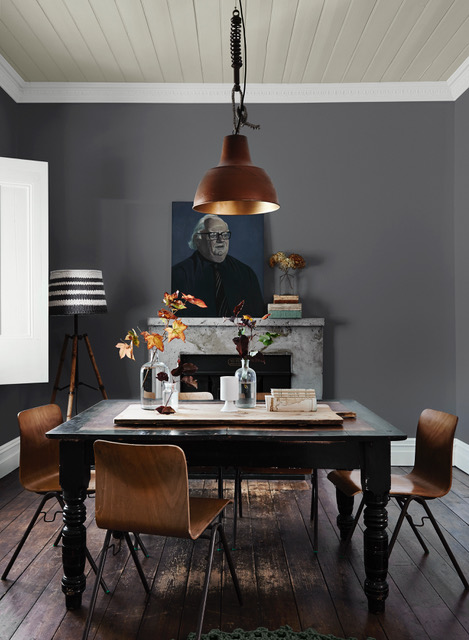
NOWSTALGIA …. a desire to return to the time when life was simple and optimism ruled. The look echoes mid-century modern design of Palm Springs with a hint of luxe!
 Colours:
Midnight Seas
Silver Shadow
Gold Mine
Fifi
Space Odyssey
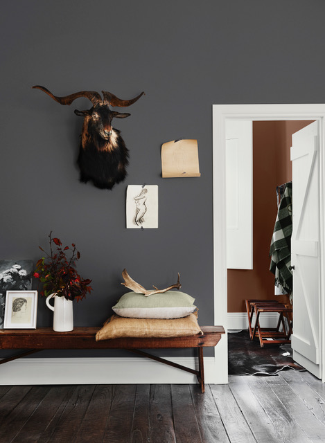
GROUNDED ….reflects our desire to gain meaning and purpose in our lives, whereby we make value-based decisions on our lifestyle and regain a connection to the environment. Botanical and mineral palettes set the scene.
 Colours:
Grey Ember
Sashimi
Fossilised
Bobby Brown
Calcium
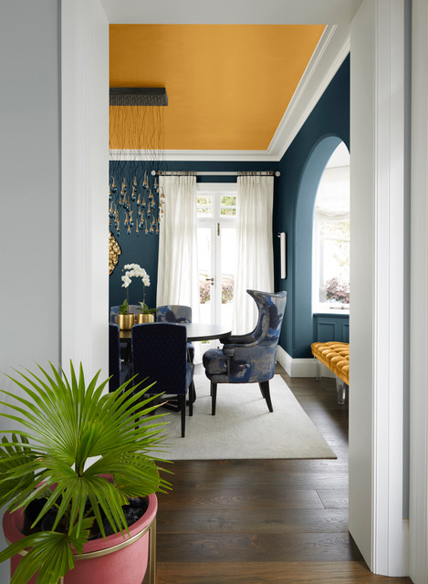
MOOD MONITOR….reconnecting with ourselves, taking time to reset and strengthen our bodies and minds. All are key focuses in this fast-paced world. Colour and light stimulate our dormant senses and we can breathe.
 Colours:
Coastal Views
Posh Pink
Alta Sierra
Imperium
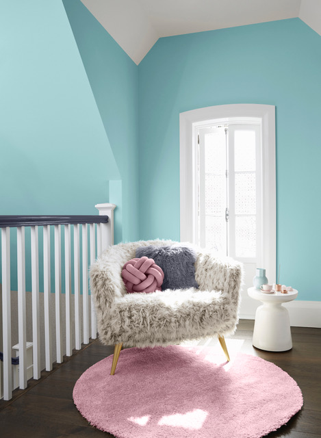
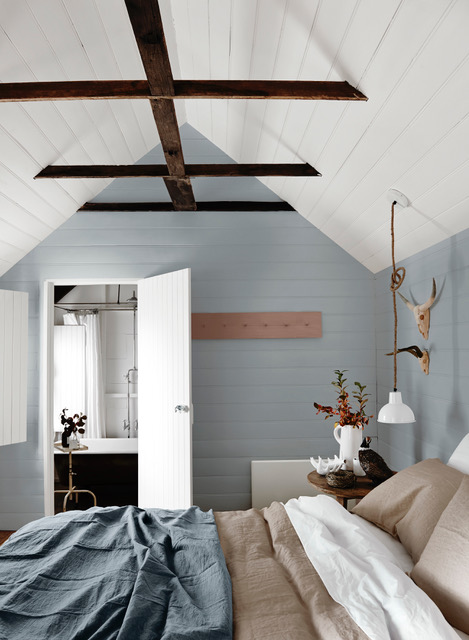
THE SLOW DOWN….JOMO..the joy of missing out. We are searching for ways of slowing down in a bid to manage our connected and busy lives. We want to spend more time at home, the fear of missing out is no more! Colours are soft and quiet.
 Colours:
Baby Seal
Subtle Hint
Pilbara Sand
Sheer Granite
The 2018 Colour Palettes are available in Wattyl’s ultra premium
id Interior low VOC paints – Contemporary Matt, Luxury Low Sheen, Silky Satin and Advanced Low Sheen.
Available nationally from Mitre 10, Home Timber Hardware, Paint Place, Solver Paint Centres and other paint specialists.
For more information visit colourtrends.wattyl.com.au